Choose four typefaces:
* 2 text faces (designed for continuous reading)
* 2 display (designed to be used in large)
Give reasons why you've chosen them:

Trashco: I found this font on dafont.com (http://www.dafont.com/trashco.font?text=Typography&psize=l). It shows type as an image through its illustrations. It reminds me of London somehow, i think it's because it looks like its bursting out and flowing.

Cold Night For Alligators: Also found on dafont.com http://www.dafont.com/search.php?text=Typography&psize=l&q=cold+night+for+alligators. If this text was in a deep red it would look so good! It's uses are limited to 'horror' genres only really but I think its got the right feel to it, I see it as informative as well as decorative.
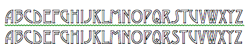
Typography
Helvetica: A font found on Microsoft Word, it's easily read and flows nicely. I tend to use it for continuous reading tasks such as essays. I've taken into consideration the spacing of the letters and I really like it and from learning about typography I see text from a more respectful point of view.

Cambria (bold): cambria (bold) is another i've chosen for the continuous reading font. It's seems to be in an older fashioned style. I prefer Helvetica but I can read this easily. It just seems a little harsher on the eye.
Considering capitals, bold, lower-case and italics
produce 4 significantly different designs each within
150mm squares and using each one of your chosen letters:
I found the font 'Circus' from dafont.com http://www.dafont.com/search.php?q=circus&text=Typography. It's fun and seems to be a stereotypical font of the circus. I find the 'P' the most fun.


Bauhaus 93, another font from Microsoft Word says Bauhaus within the text. I like the 's' in the lower font but the 'F' in the upper case, its pretty bold already so I don't think I need it on the bold setting.
Desdemonda: I found this font on Microsoft Word, it only has the option in capitals. I love this font as i'm a big fan of Art Nouveau and this, to me says Art Nouveau. I like all the letters but i think i'm going to choose the 'A'. I like the way it curves round and flows.
I got pretty confused at to what we were supposed to be doing, whether I was to use all four of the letters in one box or one design four different boxes with one of each font in them?????? To be on the safe side I'm going to do four of each!
For some inspiration I researched David Carson, an obvious typography artist but when i see his work i feel so inspired and wish i could achieve work like his:


When researching David Carson i found another artist who I really liked:
Yulia Brodskaya's work is usually paper based, but not pen and paper but more like origami paper based, her work is intense and delicate, I was truly amazed when i first saw her work. It's taking typography out off the computer and making it 3D and pretty:


www.google/yuliabrodskayas.com
I found inspiration from these artists, especially Yulia Brodskayas. I like the fact that she works off the computer, her work seems so raw and visually pleasing. The curves flow and as they curve you follow and end up taking in all the details of her work.
I was having trouble downloading the 'Circus' font from dafont so i chose the nearest to it which i found on Microsoft Word called 'Rosewood Std'. Using this font i created a sheet in Photoshop exploring the possibilities within my assignment:


Using Adobe Photoshop I played about with the placing of the letter. I wanted to audience to work and feel like they were working to help piece together the final, whole picture.


American Typewriter: I feel this piece is stronger then the Rosewood Std 'P'. I think maybe because it's a font that we've all been familiar with for so long. Its a stereotypical font that has been around for generations and has been used from first draft books to war messages.
Bauhaus 93 was my next option, I really liked the 'F' as it seemed to feel more flowing then the other letters:

From just looking at these three examples of the different fonts i much prefer the Bauhaus 93 and America's Typewriter a lot more then the Rosewood Std, it's too illustrative and distracting for me, the other fonts seem to hold it all together more. The negative space within the 'P' in the Rosewood Std font i'm finding very distracting and hence not holding the piece together.

My three best (in my opinion)


I was confused when first reading my assignment and decided to experiment with using four different fonts within one box, i wanted to show that i wasn't afraid of experimentation which was one of my previous weaknesses.


Using the fonts Rosewood Std, Giddyup Std, Ardarling and Arherman found in Adobe Photoshop i played around with not only the letters but also i used the pieces of letters that i had cut out. I think my most successful piece was my third (bottom) of the three.
From doing this i've become more confident in photoshop and learnt that if you just play about it't not going to matter if you make mistakes and it can make you achieve ideas for something that has a lot of potential.
_____________________________________________________________________________
Compose the following text within a 150mm box. Limited to black on white and using one size of Adobe Garamond. Make use of: leading, alignment, spacing and orientation. Decide to use capitals or small case, bold and italics.
"Important operating instructions for vertical blinds. Please note: these blinds must not be drawn backwards or forwards without the blades being turned to 90 degrees i.e (so that you can see through them} Failing to do so will result in damage to the blinds. Thank you for your co-operation."
Using InDesign (which i'm currently having tutorials on) I wanted to explore the possibilities as i've used Photoshop and Illustration for my other units.

Above: My first draft of the task. I think there's too much space on the top. I've decided to make the box have a stroke as it pulled the piece together and somehow made it look more important.

Above: I moved the text up and played around with the bold and italics. I prefer this lay out but the first bold and italics

Forgetting that I could only use one font I enlarged the first warning and felt this drew my eye and I wanted to read on

Above: I wanted to see what all the different stokes would look like, I placed them all in my document and decided that what I first went for was what I would stay with.
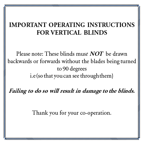
My final: I didn't really know what else I could have done. I became bored of this project as although the limitations to the unit were better as you couldn't stray too far I found I like to stray and push the boundaries but it's something I need to get used to for in the professional world.
InDesign:
The Tool bar:

 = Font Size
  = Size of gap between lines
 = Size of gap between letters
  = Size of gap between

 = Change individual text
  = Italics control
'A designer who isn't interested in, or can't be bothered to detail text is one who doesn't care about effective communication'
Phil Baines and Andrew Haslam - 'Type and Typography'
___________________________________________________________________________
You will be given a text taken from 'Oblique Strategies - One hundred Worthwhile Dilemmas. Visually express the strategy you have been given using a typeface (or typefaces) of your choice, in a way that you think appropriate to the text.
You may choose one other colour, and as many, or as few typefaces as you wish.
A minimum of six rough layouts.
TYPOGRAPHIC ELEMENTS ONLY TO BE USED - NO ILLUSTRATION.
Only one element of each kind
I'm really excited about this unit. Even though we have restrictions which I don't usually like I like the fact that we can do something within it that we can make our own.
Thinking about what elements could suggest I looked in the dictionary to see what that would say. It came up with the periodic table which instantly set me off thinking.

I want to play about with using pieces of the periodic table and it's elements to produce my saying:

I forgot about only being allowed to use one colour but the general design i'm really happy with and think it works well. My design would work perfectly if people instantly thought of the periodic table.

I changed the colouring so it's all one colour but then is the stroke on the edge of the boxes classed as a colour? The final design would be on a subtle grey. I used the graph as a guide for myself.

I took away the stroke on the boxes and I didn't like the end result. It merged them all together and I don't think it screams periodic table and that these are elements.
I looked at other definitions of 'elements' and decided to experiment with weather elements.
Using the words I wanted to show the different weather elements but I don't know if this is then creating an illustration out of my text..........


It doesn't work too well for all the weather elements as you can see.......


Again it either works or it doesn't

I wanted to see what white colouring on a black background would look like, it's probably more effective but why am i using black on white or white on black when i can use colour?
A quick bit of research on 'oblique strategies':

Oblique Strategies - One Hundred Worthwhile Dilemmas was invented in 1975 by Brian Eno; musician, composer, record producer, singer and visual artist and Peter Schmidt; an artist, theoretician of colour and composition and teacher. Each card reads a different sentence to help creative thinking.
I needed some inspiration so typed into google 'expressive typography'. I discovered some amazing artwork:

I loved this as soon as I saw it, I know i'm not allowed to make my text become an image but for research purposes I think its quite strong.
Whilst researching I discovered the typography artist Ebon Heath, a young american artist who expresses his work through typographical mobiles. His works have been referred to as 'visual poetry'. He tries to visualise the invisible through his work. I read an article from the following website: http://www.yatzer.com/Ebon-Heath-and-his-visual-poetry


An example of Heath's work, i love how his work looks like its alive.


I think Heath's work works as a 3D sculpture or as a flat image.
I found this quite interesting, i liked the use of mixture between typography and photo. I love the way the text flows and you don't notice that your flowing along with it.

I clicked on the link to see if the artist had done any other work but she hadn't. She had however written a quote which i liked so much i wanted it write it down:
'Empowering and silent, but ironically loud. Design is expressive, yet concept driven. Design is utilized for good, but sometimes evil. Design is what you wish…an outlet…a tool…a voice…a field of multiplicity allowing for a viral sprawl of ideas. Design is challenging, inspiring and satisfying. Design is what you make it to be.'
I found this blog which I find matches what we have been assigned to do:
A few images from the blog:


Other elements could be earth, wind, water and fire. I got this idea from when I was watching The Fifth Element film. I thought that I could show the word: 'Only one of each element' in the style of the elements:


I came up with this using illustration. I struggled and didn't succeed doing the upward element but here's a quick idea example:

I don't think it works as well as i'd like it to at the moment but I think with time and some work it could be successful. In this image the background colour is all wrong, un naturally yellow and the font is too close together.

Now with a few ideas i'm struggling to choose which one I should choose to have as my final. I've asked a few people on their opinions and they feel that although they all work my first elements of the periodic table idea worked but was maybe too confusing, the weather elements idea works but i'm not too sure on whether i'm allowed to use my text with it making an image. My last idea with the elements; earth, wind, water and fire people have liked the most. I think it still needs to be worked on a bit. Maybe the font, the current font i've used is 'papyrus' as I find it most fitting with the colour and the most natural looking font.

I worked on the idea that most people seemed to prefer. I chose to change the background layer so it looked like a more natural stone colour. I want to find a better font as although the 'papyus' font kind of works, it's not perfect and I want my work to look perfect.

I went on dafont.com (http://www.dafont.com/theme.php?cat=107&page=12) and tried to find a more natural looking font, with trying to show natural elements I also wanted to find a font that looked like it was eroded. I felt that it would fit in better. I found loads of fonts but it was a process of trying and testing.

I finally found a font called ' All used up' and it's a perfect match to what i was looking for:

It's got enough fade to show erosion but it doesn't also look as though it has too much fill on it. I think this one's going to be perfect for what I was thinking.
My final piece:


A closer view of my final piece
After asking people's opinions on the different fonts the 'all used up' font was most popular. I really like the end result. It looks like just the symbols and then you realise that there actually the words 'only one element of each kind'. I don't think there's anything else i could have to done to improve this as I wanted to keep it simple and natural looking as elements are after all a natural thing.
If i were to print this out i would consider printing it at A3 size, i don't think this image needs to be bigger or small to make an impact, it can be seen at any size and be read the same. Obviously the smaller the image the smaller and less visible the words will become but if it was a huge piece of work the symbols may be lost.
____________________________________________________________________________