Create a screen based narrative based that will function as a title sequence for a narrative of your choice:
I've always had a passion for film and music videos, i never knew why, I'd watch the 'how its made' DVD and would rather be uncomfortable during a whole film then miss the trailers or the title sequence, i've known that my dream job is within the film industry but never knew where i could fit into the giant puzzle. When given this project, it all seemed to slot into place. Motion graphics is where i want my career.
Some of my favourite sequence titles:
Sherlock Holmes
James Bond - Casino Royale
Lord Of War
Catch Me If You Can
Se7en
Zombieland
James Bond - Golden Eye
The Girl With The Dragon Tattoo
http://www.youtube.com/watch?v=tcp9Ysi75f0
Final Destination 3
http://www.youtube.com/watch?v=t4scD8MWNlU
Final Destination 4
http://www.youtube.com/watch?v=lOLDUQCESmE
Final Destination 5
http://www.youtube.com/watch?v=tBqfff848ik
To have a successful title sequence you need to have a narrative, a narrative is basically a story which has a beginning, middle and an end. This can be so the audience can pick up a little of the story or get a feel of what type of film their about to watch. A title sequence can also catch people up on movies which are following on from other such as Spider Man 2. A title sequence doesn't have to be just images and text, it can be whatever you want it to be, audio and image, audio and text. As long as you have some sort of narrative you will succeed.
There are five fundamental principles of interactive narrative:
1. Narrative intention: The point of the narrative, or in the case of an interactive narrative, the viewer experience. The narrative intention should answer the viewers questions, 'Why am i viewing this story?' and the authors question 'Why am i telling it'.
2. Narrative Immersion: The quality of the viewers reception of the narrative. How do we manage interaction with the viewer without distracting them from or otherwise disrupting the narrative.
3. Narrative structure: The form, shape and rhythm of the narrative. As such narrative structure is inherently a function of the temporal nature of the narrating; it relates to the time of the telling.
4. Narrative response: Encompasses the fundamental question for any interaction narrative 'How does the narrative respond to the viewer?' or conversely, 'How does the viewer influence the narrative?'
5. narrative Guidance: The culmination if each of the proceeding properties; it concerns fundamental challenge of providing narrative structure and responsiveness while preserving narrative intention and immersion.
A few inspirational people of the Graphic title industry include:
- Saul Bass
- Kyle Cooper
- Steven frankfert
- Susan Bradley
Saul Bass:
Saul Bass is in the Graphic Design and film industry best known as a legend. He started out as a Graphic Designer but then turned more into a film maker; focusing on the title sequences which is probably the most important part of a film. The title sequence makes us excited for the movie, it's job is to grip the audience and make them want to watch the rest of the film including names of the director, executives and cast. Unfortunately there is no award for best title sequence which i completely disagree with and have always thought that the titles are sometimes better then the film. When a new James Bond was coming out i was more excited about the title sequence then the actual film!
To Kill A Mockingbird
When researching Saul bass i found this clip on youtube, its Saul Bass' 52 title sequences montaged into one:
Probably best known for his title sequence for 'The Man With The Golden Arm' by Otto Preminger. Bass uses cut out paper to create this sequence, it's so simple but so effective. Bass said that he used the powerful arm instead of Sinatra's face because he knew 'that the arm was a powerful image of addiction'.
By the end of his life Bass created over 50 title sequences for Preminger, Alfred Hitchcock, Stanley Kubrick, John Frankenheimer and Martin Scorsese.
Kyle Cooper:
Kyle Cooper who studied Graphic Design became most famous for his title sequence in 1995 for the film 'Se7en' but has done over 100 title sequences! Including Spiderman, Superman Returns and Dawn of the Dead.
To explain how a title sequence can give us a 'feel' about a film, build the tension and give us a subconscious insight of the film i will use 'Se7en' as an example:
From the very start of the title sequence we feel on edge, the typography is hand written and has a 'scratchy' feel to it with just a black background.
We see images that give us a feel of infection, insanity, dirt, darkness and dinginess, it makes us feel unclean and reminds me of dirty plasters and puss.
Cooper has planted imbeds in the audiences mind, were starting to build a story. We now know that this person we are watching but not yet know the identity of has a dark obsession which reeks of infection and is not a healthy obsession.
I thought that the clever use of shadows was consistent through out the title sequence.
If we do not already feel uncomfortable i think the point of turn comes when we see the mystery person starting to cross out words from a page with the title 'When your pregnant'.
To cross out a persons eyes on a picture to me symbolises death. Many psychotic killers through out history who have been obsessive have been found with in depth 'research' of their victims and pictures with their eyes either drawn over or scratched out. A disturbing fact that we are reminded of within a glimpse of this picture.
However the whole way through the title sequences we still feel a sense of confusion as we've seen a glimpse of what is going on, possibly more then what the rest of the characters have seen so we are given a 'sneak peek' or a helping hand when trying to put together the plot and play detective. The use of flickering images and scratching keeps us confused and bewildered.
The music through-out a title sequence is key. We want the audience to keep the suspense but not bore them. The music though-out this title sequence reminds me of pain and reminds me of my fear - dentistry. The squarks reminds me of nails on a blackboard. There's nothing nice about this music, however it's not so bad that the audience wants to
walk out because it's unbearable.
So the mixture of well suited music and imagery that explains a little of the story and creates imbeds makes the perfect and what i consider should be an award winning title sequence.
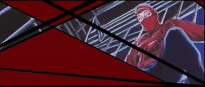
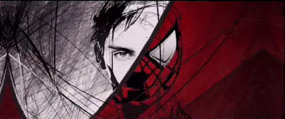
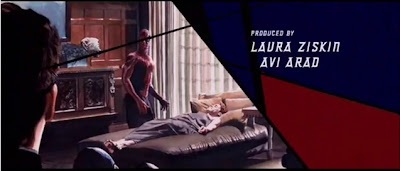
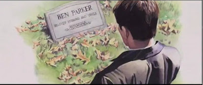
So when it comes to a film that is a trilogy, for example Spider-man, you may be watching the film with someone who hasn't seen the first Spider-Man or you may not have seen the first Spider-man film for a while that you feel you may need to be reminded of what happened in the first film. Spider-man 2's title sequence shows this amazingly!
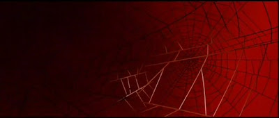 |
The title sequence opens up with the highly recognisable colour red
flooding the screen with chrome silver spider webbs thrown about
the screen. |
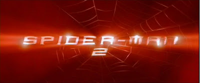 |
The chrome silver title spreads across the screen then shifts us off
to another scene |
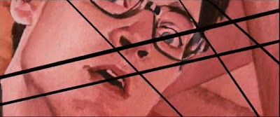 |
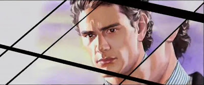
A beautifully hand drawn frame is shown of a scared, geeky
Peter Parker |
 |
Panning down we see a spider, however we do not see the spider bite
Peter Parker but i'm confident that pretty much everyone, or at
least every one who is watching the film knows how Spider man
turns into Spider man. |
 |
We pan across again to meet Mary-Jane, Peter Parker's crush
and next door neighbour, the thick line dividing them and distant
look from Mary-Jane suggests them to be just friends |
 |
We're shown Harry Osborn, Peter Parker's best friend, just a glimpse
but the fact that we have seen him in this 'catch up' session
we know that he has some importance. |
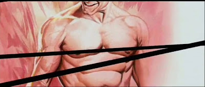 |
We see in amazement Peter Parkers dwindly body has turned buff
and covered in muscles |
 |
| The fist clenched suggests power and heroics |
 |
Peter Parker tests his new powers out in a cage fight, we don't know
much information but we can see that he is testing his boundaries,
the change of tone in the music makes the 'mood' change. |
 |
| More clues for the cage fighting |
 |
A key character, but we don't know this necessarily unless we have
watched the first film, again the fact that we're seeing this dodgy
looking character running with a gun and a 'stereotypical' money
bag suggests a robber |
 |
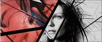
Who is this man Peter Parker is cradling? The washed out colours
suggests mourning, what has happened? What is the connections
between the last shot and this one? |
 |
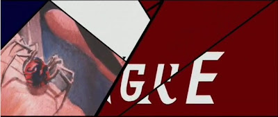
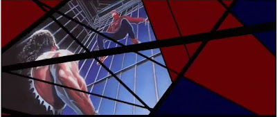
REVENGE, Spider-man seeks revenge, the cross section of
Peter Parker and Spider-man suggests the two have become one |
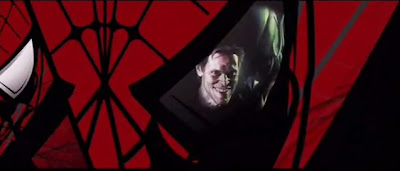 |
Cleverly shown, Spider-man on the left and Norman Osborn
(Harry Osborn: Peter Parker's best friend) Norman Osborn's
alter ego is the Green Goblin who becomes Spider-man's arch
enemy |
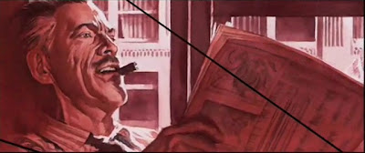 |
We're shown J.Jonah Jameson, the editor for the Daily Bugle.
Peter Parker's boss |
 |
| Spider-man kissing Mary-Jane, love is in the air |
 |
Shown with Spider-man's colours and webb layout we also see
a 'loved up' Mary Jane |
 |
Mary Jane makes it a bad habit of getting rescued by Spider-man.
We start to think that there is some special bond between them |
 |
We're shown Peter Parker with Aunt May, we don't know this is
Peter Parker's guardian and Aunt but seeing Peter Parker
sitting at this ladies bedside suggests a connection |
 |
| We're reminded that Spider-man is searching |
 |
Norman Osborn is shown looking insane, the hint of green on the
right side of his face shows him being taken over by
the Green Goblin |
 |
The results of a great battle, both Green Goblin and Norman Osborn
are dead, with respects as this is Peter Parker's best friends dad
and only parent has died by his hands, he returns him home
so that he can be buried by family |
 |
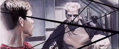
The plot thickens, Harry walks in to find Spider-man next to his
fathers dead body, revenge is on Harry's mind |
 |
Through out the whole sequence title we are reminded that
this has come from a comic book |
 |
| A reminder as to why Peter Parker got into this mess |
 |
Too wrapped up in a world of revenge and vengeance, Peter Parker
doesn't realise that his crush, Mary Jane now has
a crush on him. A world burdened.
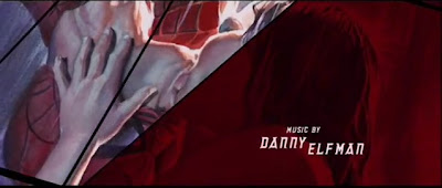
This all shown to the upbeat music which reminds us of Superheroes
A whole film summed up in 2 minutes 22 seconds, amazing.
|
It's not just films that need to have an amazing title sequence to grab their audiences attention, tv shows also need this too. Take Buffy The Vampire Slayer for example, it's up beat music makes us have a rush of adrenaline and are up for slaying some vampires, it's quite thrilling:
http://www.youtube.com/watch?v=fHhYsch-49c
My absolute behavioural TV title sequence is 'Hustle'. It's amazing:
It reminds me of the James Bond title sequence in Casino Royale, a personal favourite. The title 'Hustle' tells us a lot about the programme before knowing anything about it but also the music, it sounds cheeky and scheming. It gets you ready for what is about to come.
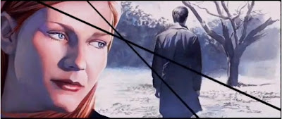
However, my favourite title sequence is 'The Girl With The Dragon tattoo'.
http://www.youtube.com/watch?v=tcp9Ysi75f0
It makes me feel utterly exhausted, the music, the imagery is just amazing, you know this is going to be an amazing film if the title sequence is this good!!
Created by 'Blur' studios director David Fincher said 'All that I’m asking you to do, is reinvent any expectations of what a title sequence could be’.
Working with Tim Miller, David Fincher worked closely to achieve a title sequence that 'captivates the viewers from the first frame' which I assure them it does.
 Tim Miller explains that Fincher's goal was to sum the whole trilogy up in 2 and a half minutes, they wanted to be as abstract as they could. 'David drove the process with a desire to convey ‘a buried story, a fever dream covered in black primordial ooze, through the visuals.' - Tim Miller
'Blur broke the Trilogy down into quintessential moments that could be translated through iconic imagery from the books, i.e.: a pressed flower, an intricate tattoo, a wasp and elements bursting into flame.'
'Those moments were distilled into vignettes that could be expressed visually. A total of 26 independent vignettes were approved by Fincher to build into the sequence. Each one is a mini-story built entirely in CG, told from a variety of camera angles.'
'During the editorial Blur shuffled the deck, allowing the vignettes to play out in a frenetic, non-linear clash of concepts employing the hard-hitting, fast cutting style established by Fincher in the first trailer, also cut to “Immigrant Song” covered by Karen O and Trent Reznor.'
'There were a total of 252 shots in the 2 ½ minute clip; each cut lasts about a mere 24 frames or fewer. Blur also created the video for “Immigrant Song” using elements from the opening title sequence that was released online on December 10th as a teaser for the film.'
Tim Miller explains that Fincher's goal was to sum the whole trilogy up in 2 and a half minutes, they wanted to be as abstract as they could. 'David drove the process with a desire to convey ‘a buried story, a fever dream covered in black primordial ooze, through the visuals.' - Tim Miller
'Blur broke the Trilogy down into quintessential moments that could be translated through iconic imagery from the books, i.e.: a pressed flower, an intricate tattoo, a wasp and elements bursting into flame.'
'Those moments were distilled into vignettes that could be expressed visually. A total of 26 independent vignettes were approved by Fincher to build into the sequence. Each one is a mini-story built entirely in CG, told from a variety of camera angles.'
'During the editorial Blur shuffled the deck, allowing the vignettes to play out in a frenetic, non-linear clash of concepts employing the hard-hitting, fast cutting style established by Fincher in the first trailer, also cut to “Immigrant Song” covered by Karen O and Trent Reznor.'
'There were a total of 252 shots in the 2 ½ minute clip; each cut lasts about a mere 24 frames or fewer. Blur also created the video for “Immigrant Song” using elements from the opening title sequence that was released online on December 10th as a teaser for the film.'
My ideas so far:
Since a very early age my parents have introduced me into a world of fairy tales and realms that involve talking animals and witchcraft. My favourite books and tales include Wind In The Willows, Chronicles of Narnia, Lord of the Rings, Brothers Grimm fairy tales and at a late stage in life Harry Potter.
After carefully considering what i wanted to do my title sequence on i decided to choose either the Brothers Grimm tale of Hansel and Grethel or Van Helsing 2. It seems to be a popular thing to create the Grimm tales into films. I love how Red Riding Hood was portrayed and showed a sinister side to the story. Also the Brothers Grimm film itself showed the darker side to the stories.
http://www.youtube.com/watch?v=zZ0icADt5Fg
http://www.nationalgeographic.com/grimm/index2.html
http://www.youtube.com/watch?v=dnboj1T3UEQ
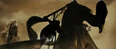
I want to show the more sinister side of the stories by having darker images. I've always been inspired by the animation in the Harry Potter film about 'The Tale Of The Three Brothers'. I did some research into this and found that a man called Ben Hibon created this:
http://www.youtube.com/watch?v=bN1_h_eGitE
 |
I love the use of colours, all the characters look sinister including the
three brothers |
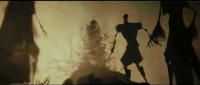 |
I think it's clever how instead of characters just appearing into
the frame they are created, A tree is transformed into 'Death'
for example |
 |
| I like the transparency used within the animation |
 |
This i thought was artistically clever, you expect the blood to
be red for extra effect but it's some how more effective
then the blood being red |
 |
| Again the way a character dissolves into something else |
 |
The clever exit of a character, being pulled up as though he is a
puppet on 'Death's' string. |
Another animation that has influenced me is Tim Burton's 1992 'The Sandman', there are no words, no text, no music, just sounds. It scares me because it has an eerie feel to it, the lack of music is also something that even though cinema first started without music, we've all got used to.
http://www.youtube.com/watch?v=UjgHbRrnjhU
I love the way directors are taking innocent, childhood stories and turning them sinister, Red Riding Hood i thought had good music in it's title sequence, i couldn't find the title sequence but here's one of the trailers, which i thought could have been done better: http://www.youtube.com/watch?v=PM8V3cHdSC4
The up and coming Snow White and the Huntsman looks amazing, again because there showing a new, even more sinister twist to the well known tale. The world is becoming a more sinister place and the fact that people are showing how evil fairy tales actually are i think is a great turn for the film industry: http://www.youtube.com/watch?v=DgfYBJoPFFw
I was inspired by my friends (Emily Richards) images she had done for college project. She makes Red Riding hood look both innocent and guilty, it has a sense of happiness yet when you look further into it you realise it has dark tendencies:
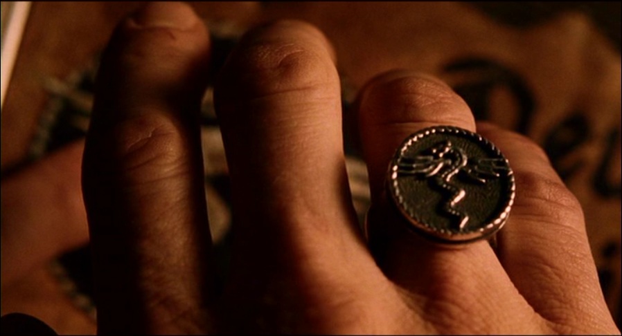
Another idea of mine was to do a Dracula and Van Helsing title sequence:
I wanted to do a Spider-man-like catch up title sequence. One and a half minutes to catch people up for the new Van Helsing 2 film.
I really liked the title sequence to Sherlock Holmes and would like to achieve something like that, i want to capture the audiences interest and make them excited to see the rest of the film, as well as let them know what happened in the last film successfully.
By watching the film i have captured shots of key characters and moments that i want to show to the audience, i would like to possibly start with a quote then start music and end with a quote. I have used youtube to find music from Van Helsing and would like to end the title sequence with the assumption that the first scene of Van Helsing himself riding on his horse. The music for this is:
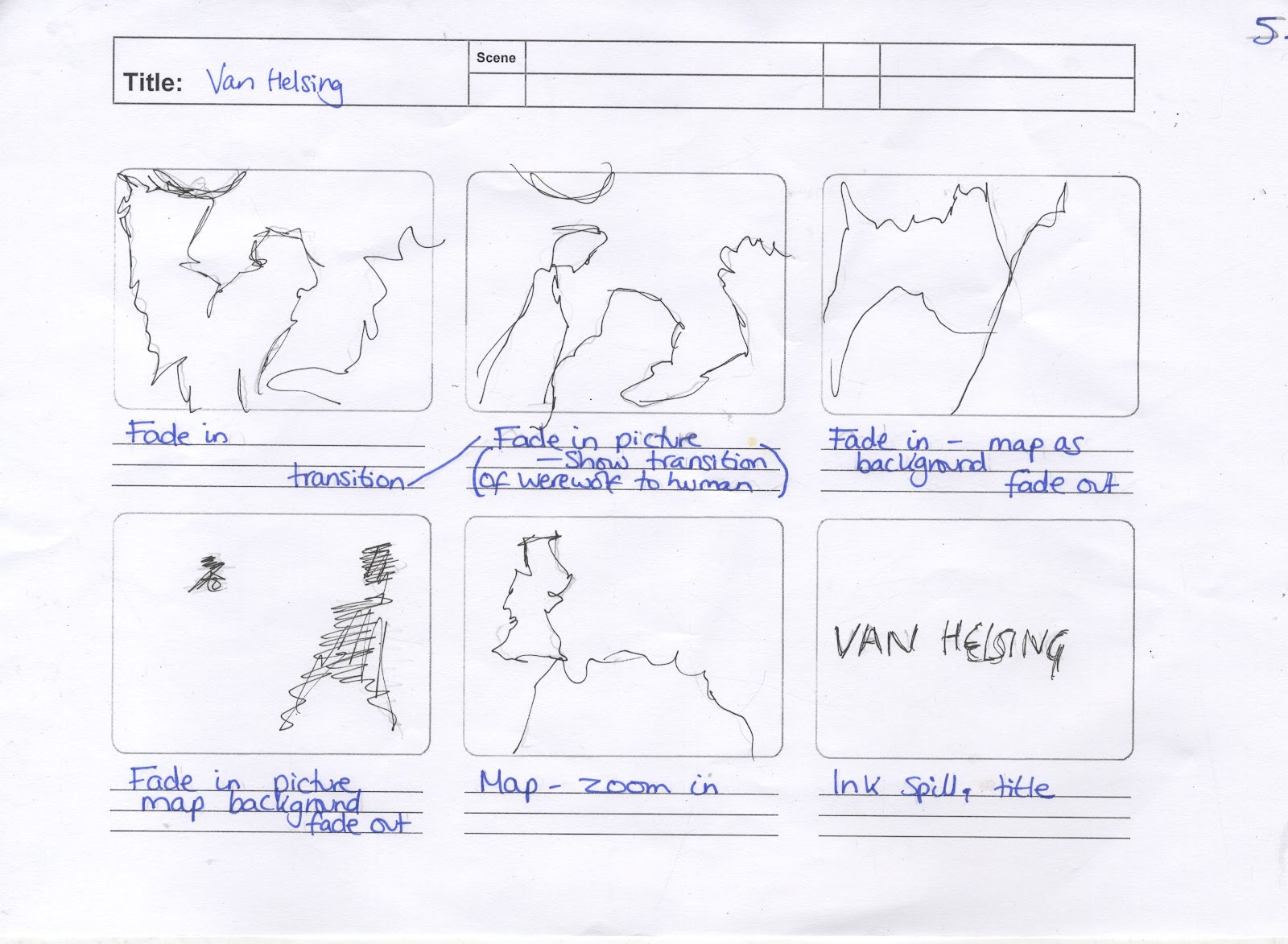
I need to incorporate enough key shots of the story line so that the audience know what has happened but not too many that i bore the audience. I need to figure out what these frames are going to be:
- Van Helsing shown as an enemy of the public
- " " shown working with the monks
- Map of Romania
- Velkan getting attacked by werewolf
- Shot of Anna Valerious
- Shot of female vampires causing havoc
- Shot of female vampire getting staked
- Dracula
- Igor and werewolves shadow
- Velkan shedding his flesh and turning into a werewolf in front of Anna
- Dracula's layer
- Velkan seeing his father on the 'chair'
- Velkan on the chair
- Dracula's eggs
- Chair conducting electricity from lightning and powers the babies
- Dracula's babies flying
- Van Helsing meets Dracula
- Dracula's babies dying
- Frankenstein
- Dracula's castle
- Van Helsing meets Dracula
- Monk discovers only a werewolf can kill Dracula
- Van Helsing gets bitten by werewolf
- Anna gets taken to Draculas castle
- The Ball
- Van Helsing discovers mirror
- Dracula's castle
- Serum
- Van Helsing turns into werewolf
- Van Helsing and Dracula fight
- V.H kills Dracula
- V.H kills Anna by accident
- V.H runs away
From inspiration from the Spider-man title sequence i don't want frames just changing boringly, i would like it to follow along and pan and zoom in and out and glide, its a lot easier to watch and get drawn into rather then something keep jumping in and out and changing.
My title sequence brief:
I intend to create my title sequence using After Effects. Heavily inspired by Sherlock Holmes i want to incorporate ink spills. I intend to take stills from the film, put them in Photoshop and put a filtered effect on them, recreating the images so i am showing the audience what I want them to see. I aim to use an old looking map, 'old age' colours, text and use music from the Van Helsing film. I want to achieve an old age feel, make the audience re cap and remember what happened in the previous film and get them ready for the movie.
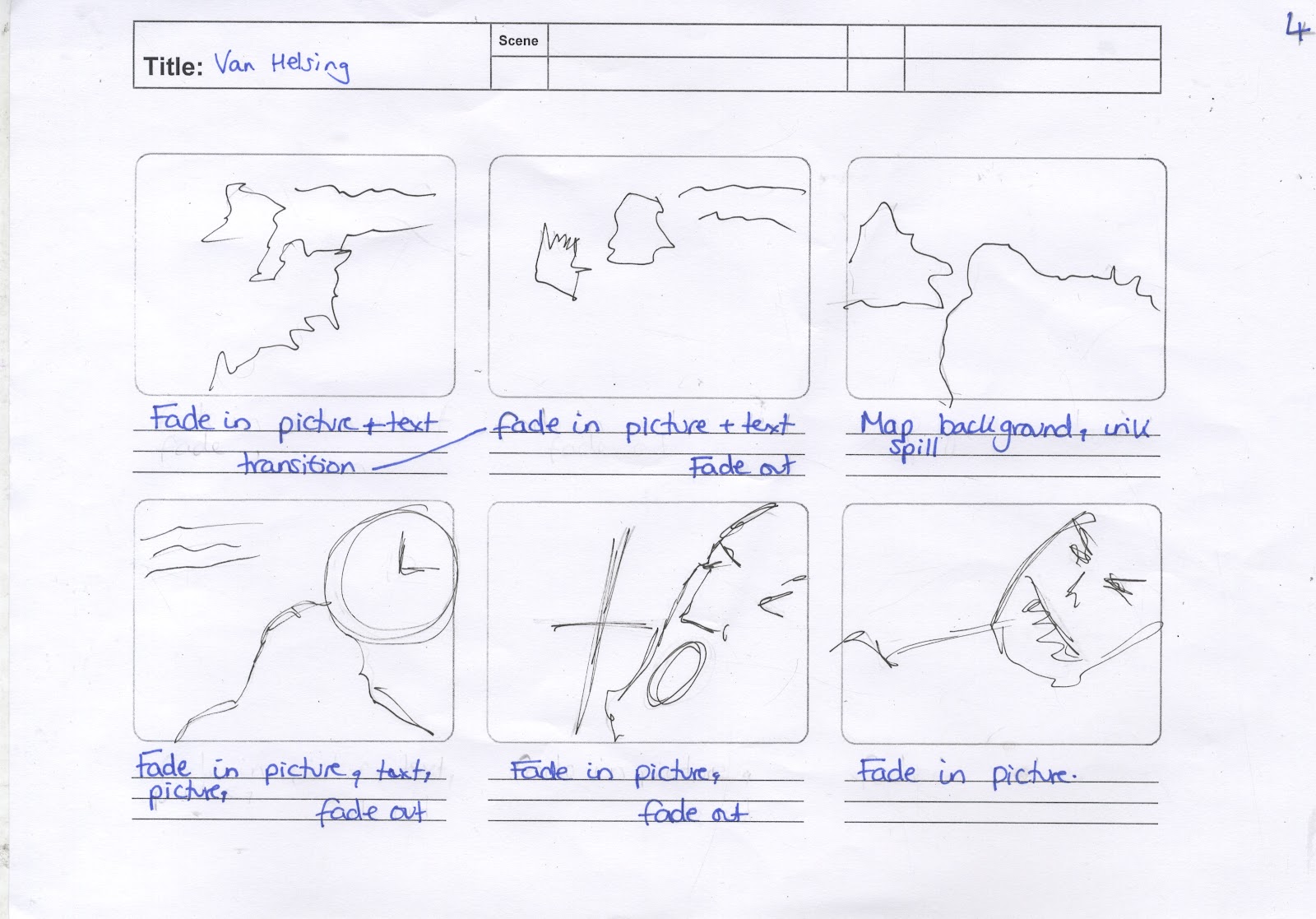
Now that i know what i want to achieve and in what style i need to start creating my story board, this technique helps layout your sequence with the ability to easily add shots and take them out.
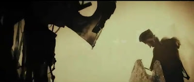
Whilst watching the film i paused it at what i thought were key scenes and print screened them.


By doing this i can pick out the pictures that i don't think are key or can come up with a way to combine a mixture of pictures that can tell the audience a bit more but having the images appear in the same slide just at a different time.
I have decided to use 'After Effects' to create my final piece, I have only used this programme once before but feel most comfortable using this. I used youtube a lot to find tutorials so everything you see i will have taught myself or found tutorials online. These are some of the links that i used:
http://www.youtube.com/watch?v=kP9LyCYhv-w
http://www.youtube.com/watch?v=yiJYn4eQdZw
I first learnt how to do an ink spill effect, I picked the technique up very quickly and was able to produce this:
It doesn't look that good on here and i need to choose a better colour panel, but you get an idea of what i want to achieve
I took the font into deep consideration. I want to use a 'blood red' colour and keep the gothic look. I went onto dafont.com and looked at calligraphy. I downloaded a few fonts. It's a process of seeing which ones work and which ones don't. I need to consider the 'Van Helsing' title.
On dafnt.com i typed in Van Helsing and found the font they used for the film!
I've chosen my colour palette, i want to use musky and dingy colours, when i think of old maps and scrolls these colours are what i think of
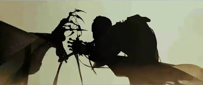
This is what i want my images to look like, i need to work out how i'm going to get my images look more interesting then just a still from the film and i don't want to exactly copy the Sherlock Holmes title sequence, i'd like to have my own touch on it
I've taken the stills from the film, filtered them in Photoshop, then used the quick selection tool and selected bits from that photo and cut them out, then placed them onto transparent backgrounds.
An example of the final image on am ink spilled background with text
I need to work out which text i'm to use, i think the 'gothic', 'script' type text is nice but it's not easy to read quickly, also the blood red isn't the best colour for every ink spill.
Comparing text
I think the Van Helsing (bottom) text works better, its bold, and easier to read quickly, it also works perfectly as, after all it is the original text from the first film.
My final video:


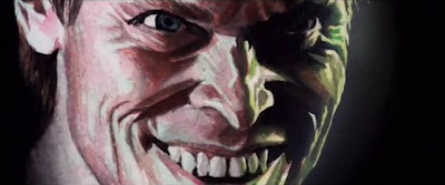
 Joker
Joker


.jpg)


