Firstly, what is a grid? A framework of spaced bars that are parallel to or across each other. (Founded in the Dictionary)
To me a grid or grid system is a system which consists of vertical and horizontal lines that helps one in a piece of art, design and photography to structure and give order within ones design. However in other areas of a grid system this ensures that, for example if one was to draw an architectural drawing, then build it, it would all be to scale and no mistakes would be made. Another example of this is an electrical grid system, the system ensures safety and efficiency.
Grids surround us all day, every day, whether this be on our billboards, on our computers, on posters, art, on the tv screen, where we live and in nature. We're we inspired and influenced by natures grid systems?


.jpg)


Architectural drawings are produced on a very tight grid system, 1cm off could potentially bring the whole process of building to a halt (as the Eurostar tunnel designers should know!)


Grid systems in electricity:

On screen grid designs show the example of:

The two most common, or rather most known or heard of grid systems are the Golden Grid system which is made for optimising web and page layouts, it can either be a visible or subtle structure. The frame work divides the page horizontally or vertically into columns and rows to order the elements of the design in a grid of X and Y pixels.

The rule of thirds is the second most common grid system. The grid system divides the image, the image being a photograph, piece of artwork or design into nine equal parts by two equally-spaced horizontal lines and two equally-spaced vertical lines. The image should sit along these lines or on their intersections. Experts say that this technique creates more tension, energy and interest in the composition than simply centering the subject would:


There are however, pros and cons to grid systems:
Pros: pros of web based grid systems are:
- Organising massive content and evenly distribute to make the relevant piece easy to follow and absorb
- Looks clean, structured and streamlined
- Offers a level of stability, i.e - for develops to use existing frameworks to be consistent
- Gives dominance over the elements without making the page too crowded or over bearing
- Easily updated or replenish it's data
- White space doesn't always look like negative space
- Mixed grid systems can be used if, for example, the design entailed complex information
Cons: for web based grid systems are:
- We become less creative
- Being less creative can be seen as boring. static and seen as a grid system to only be used as a fixed layout
- If the designer doesn't use the appropriate layout this can make the ending result look unprofessional
- No scalability of some elements can be a result
- Creates visual clutter
Using InDesign with a page layout of 200x200mm create a grid with 8mm margins all around and four vertical columns with 4mm gutters. Divide the grid horizontally using guidelines into four 4mm gutters.
Arrange the text below the grid. Create three different signs on three different pages. You are limited to using one only of the following Swiss typefaces: frutiger, Helvetica, Sabon, Univers. Do two layouts using 8pt type only, and one layout that introduces one additional size of type.
.jpg)
My first layout shows a simple approach, its very clear as to which pieces of texts go with which short statement. It's not until studying and doing typography tasks that you realise that it's been drilled into you since primary school to write the author and the relevant information at the bottom right of the page and that we all automatically assume that were going to read the text given to us from left to right and that us, as graphic designers have taken text and made it as simple as we can to make the audience work less.


Project 2:
Create a leaflet for a lecture series, with the title 'Design Without Boundaries' to be held at The Design Museum. The speakers represent a range of design disciplines.
You should consider carefully the typographic hierarchy of the information so that the information for each lecture is clearly communicated and that your design is appropriate for the Design Museum.
For each of the lectures, you must include an image. You will need to research this image - it could be of the speaker, or their work, or both.
The sheet size you must work with is A3.
It must be folded to one of the formats on the reverse of this sheet. You may. if you wish, use colour and any typographic elements (lines, shapes).
To achieve this project I'm going to visit the Design Museum to experience the atmosphere and view the museum, pick up some brochures to see their design format and aspects that they already have as I think the lecture brochures have to be 'a part of' and run along the same format of which already existing brochures have.
The Design Museum:
I visited the Design Museum website to get a feel of what already existed:

As you can see a very simple layout and simple text. The only thing that seems to stand out is the colour of the text.
I want to use the same colours, font and layout as i want the leaflet to look as though it really fits in with the museum. I'm going to use the big numbers and coloured banners that they do already:


I had a look on the 'talks' section to see what layout they already use. Again very simple and with only one picture. I think I've got enough ideas about the layout, i need to find out what font they use so it's not different

The closest thing i can find to the font is 'Arial Black', until i can find a closer match i'm going to use this font to do my examples and planning in.
I'm going to have to research grid systems, layouts, theories, design aspects and information design to do as professional job as I can. Here's some examples of my first ideas:


I did these in about an hour on illustrator. These are just roughs which i'm going to put into InDesign to get all the type neatened out and all in the right place on every page. I think the text has to be thinner so more lines of text is used as at the moment it's too wide for something to be from the Design Museum.
The next mission is to find images to go with the text.
 M/M - Graphic Designers: Mathias Augustyniak and Michael Amzalag together make the Graphic Designers M/M founded in 1992. Known best for being art directors they have worked with musicians, fashion designers. magazines and contemporary artists. Lecture text: Through their work as graphic designers and creative directors in the fields of art, fashion and music, Michael Amzalag and Mathias Augustyniak have established M/M as a powerful force in contemporary French culture. After meeting at art
 school in Paris, Michael Amzalag and Mathias Augustyniak founded M/M in 1992. They have since worked together as graphic designers and art directors on fashion and art projects mostly for long standing clients and collaborators – such as the fashion designers Yohji Yamamoto and Martine Sitbon, and the photographers Craig McDean, Inez van Lamsweerde and Vinoodh Matadin.
 Derek Birdsall -Graphic Designer. Designed books for Penguin and Pirelli calenders. Awarded Prince Philips Designers Prize in 2005. Lecture text: Birdsall's evolution as a virtuoso book designer is the clearest indication of the principle of transparency that he attaches to design. He is troubled by what he calls the notion of 'the designer as It' - as an egocentric expressionist (or Author as current discourse has it) - which is unsatisfying in practise, ephemeral in effect and ultimately 'tragic'. The preface to his 2004 book notes on book design - part reflective treatise, part technical manual - introduces 'simply the decent setting of type and the intelligent layout of pictures based on a rigorous study of content'. This is the organising sensibility of all great graphic designers, who manage to contrive tension and sublimity within the exercise of reason.
 Droog - Design Collection. Dutch based company founded in 1993 who help others design their ideas and work. Lecture text: Co-founded in 1993 in Amsterdam by the product designer Gijs Bakker and design historian Renny Ramakers, Droog has defined a new approach to design by mixing materials and interacting with the user.
They called the collection Droog Design after the Dutch word ‘droog’, which translates into English as ‘dry’ as in the dry wit, or wry, subtle sense of humour that characterised all the pieces
they exhibited.
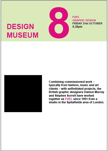
 FUEL design - Graphic Designers, founded in 1991 FUEL design specialise in commercial work but especially music, art and fashion. Liked to do ambiguous and thought provoking messages. Lecture text: Combining commissioned
 work – typically from fashion, music and art clients – with selfinitiated projects, the British graphic designers Damon Murray and Stephen Sorrell have worked together as FUEL since 1991 from a studio in the Spitalfields area of London.
 Graphic Thought Facility - Graphic Design, founded in 1990. Producing a range of work for companies such as Habitat, the Science Museum, Tate and worked a lot with Frieze magazine. Lecture text: By defining a distinctive
 graphic style to a diverse range of projects, Graphic Thought Facility has emerged as one of the
UK’s most influential – and productive – graphic design teams. Founded in London in 1990 by Andy Stevens and Paul Neale, GTF now works for such clients as Habitat, Shakespeare's Globe Theatre and the Design Museum. The work of GTF is defined less by a distinctive visual language than the rigour with which the designers approach the process of developing and
executing graphic projects.
 Graphic Thought Facility - Graphic Design.
 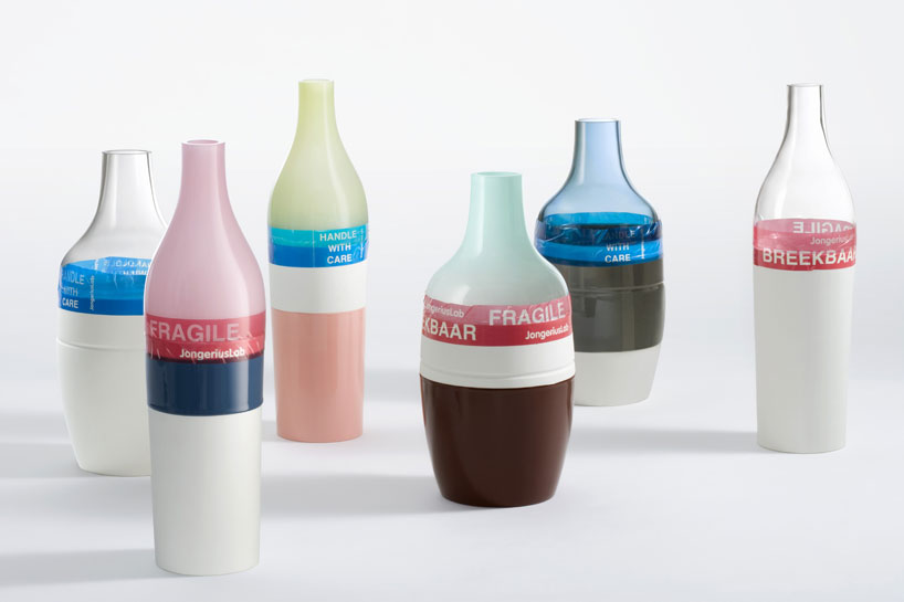 Hella Jongerius - Product Designer works on design, craft, art and technology to bring together contemporary and traditional influences. Lecture text: The Dutch designer works on the cusp of design, craft, art and technology to fuse
 traditional and contemporary influences, high tech and low tech, the industrial and artisanal.
Standing in the Design Museum Tank on the river front was a wooden table laden with
food and illuminated by five lamps with ceramic bases and silk shades. On closer inspection
it was apparent that the 'food' - a loaf of bread, fish, fowl, sausages and artichokes - was made from hand-blown glass and the lamps were embroidered with images of the animals, inspects and birds printed on the silk. Stranger still, the floor was covered in rich brown soil.
 Irma Boom - Book Designer, based in Amsterdam Irma works on book design based on bringing oddities together; unfamiliar materials and formats, colours, structures and typography. Lecture text: Many of the most beautiful books to have been designed in recent years are the work of Irma Boom. Born in Lochem, the Netherlands in 1960, Boom has won international acclaim for the iconoclastic
 beauty of her books. Her most ambitious project to date was a book celebrating the centenary of the Dutch conglomerate SHV in 1996to which she devoted five years of work.
 Jonathan Barnbrook - Graphic Designer/ film maker and typographer. Most known for his album art work he did for David Bowie's album 'Heathen' in 2002. Lecture Text: Barnbrook is one of the UK’s most active graphic designers. Pioneering the
 notion of graphic design with a social conscience, Barnbrook makes strong statements about corporate culture, consumerism, war and international politics. Working in both commercial
and non-commercial spheres, Barnbrook combines originality, wit, political savvy and bitter irony in equal measures.
 Stefan Sagmeister - Graphic Designer, His motto is: 'Design that needed guts from the creator and still carries the ghost of these guts in the final execution'. Sagmeister goes on a sabbatical every 7 years to produce his own work and travel. Lecture text: Sagmeister is among today’s most important graphic designers.
 Born in Austria, he now lives and works in New York. His long-standing collaborators include the AIGA and musicians, David Byrne and Lou Reed. Striking to the point of sensationalism and humorous but in such an unsettling way that it’s nearly, but not quite unacceptable, his work mixes sexuality with wit and a whiff of the sinister.
I have to research a bit more into these images but I just typed them into Google and this is what I found. But for the mean time I'm going to use them just for an image with my picture rather then a black box.


I've decided to go with the 4-penal accordion fold leaflet, to me it makes the most sense as the layout is easy to follow, the only problem with my designs and the leaflet is that the leaflet has 8 sides and i need 9, i need to make space some how...........


As you can see i have tried to incorporate the 6th talk in with this page, this was the only way i could work the leaflet to run in sequence. I've used the pale green that the Design Museum use on their website as the leaflets background colour instead of white so that hopefully the readers of the leaflet can see where the 6th information is written. But when looking at it it seems to be a design 'without boundaries'.
I've used Illustration as i have tried using InDesign but i struggled so much. I'm going to need some more lessons in InDesign before feeling confident enough to use it with a project.
I printed out a colour copy of the design to see what it looked like as colours appear much different on paper then it does on screen and defects can be seen easily, I also noticed that the text was far too big and needed to be a smaller font size. I spotted ten defects and when talking to my tutor thinking i was nearly finished we realised that i had forgotten to put the first lecture on! What an idiot! I struggled putting the sixth lecture on, i was going to have to completely re design my leaflet!


I changed the font size to size 10 and made the images smaller and more consistent of each other. As i couldn't fit the ninth lecture on the page with the rest of them i thought it would work well with the flow of things to put it on the back page rather then squeeze it all on the other page with the others. I could have put the other lectures on the back page with the ninth lecture but it all seems to work and each lecture compliments the other. I used grid lines and ruler guides so i had a grid to work on which is shown in the above design;


A close up example of my grid system and guide lines

Close up of the ruler lines ensuring me to line up the text with other paragraphs, of course this may have been easy in InDesign but I don't feel confident enough to ensure i can use this and make a good leaflet out of it.

I experienced problems when trying to print my leaflet, i didn't take into account the fact that when i had to print, to ensure my 'design without boundaries' border would be cut off if i printed exactly to A3, unfortunately i had to print 'to fit the page'. I then discovered that i had somehow made a drastic mistake, i didn't take the border into consideration when it came to the width of each panel. A very silly mistake but one that i have learnt however. I had to use a new grid system:

I had to make the two middle columns bigger, somehow i had managed to mess up my grid system so i was classing the edge of the leaflet as where the border was. I don't know how this happened but the fact that i had picked up the de-fault i see as a learning curve.
I had to re arrange things to make them fit and i printed each leaflet side off to see it as a proof and to highlight where the mistakes were and see if the font was at an appropriate size. I've learnt that no matter how perfect something looks on the screen always print it off and seek out the mistakes and test it to see if it works. I noticed some of my pictures weren't of a good quality and didn't look like they were positioned right on the page.
My new grid system:


I decided when i did a proof print that it would look better if the text was closer to the edge of the page, using a grid section i made sure that each piece of text were 1mm from the edge apart from those of which wouldn't have worked.


To ensure that the two sides were going to line up and match for folds i laid them on top of each other to see they would fit, this being easier then printing out proofs and trying to see:

No comments:
Post a Comment